How to Read the Efficiency Chart (Stroke Rate vs. Pace)
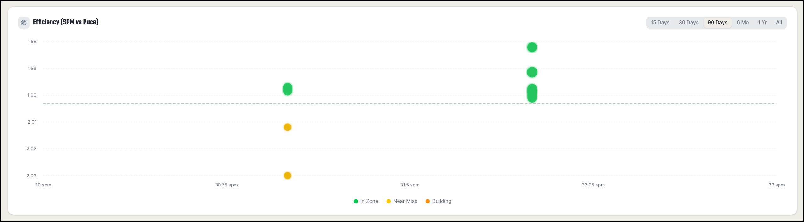
The Efficiency chart (SPM vs Pace) answers a simple question: how much speed are you getting for each stroke you take? Two rowers can hold the same split — but the one doing it at a lower stroke rate is rowing more efficiently.
How to read the chart
Each dot is one workout:
- Horizontal axis — your average stroke rate (SPM, strokes per minute)
- Vertical axis — your average pace per 500m (lower on the chart = faster)
Hover over any dot to see the workout's date, pace, stroke rate, and distance.
What the colors mean
Dots are color-coded against your personal pace goal, so the chart is unique to you:
- Green (In Zone) — pace at or faster than your goal
- Yellow (Near Miss) — within 5 seconds of your goal
- Orange (Building) — more than 5 seconds over your goal
If you change your pace goal, the whole chart re-shades against the new target.
What patterns to look for
- Green dots at lower stroke rates are the gold standard — you're hitting goal pace with relaxed, powerful strokes. That's efficiency.
- Green dots only at high stroke rates (28+) suggest you're buying speed with turnover rather than power per stroke. Try lower-rate work (18–22 SPM) to build stroke power.
- A tight cluster means consistent technique. A wide scatter means your stroke changes a lot session to session — worth paying attention to what the green sessions have in common.
- Dots drifting down-and-left over time is the best trend you can see: faster pace at a lower rate.
Why stroke rate matters
Rowing faster by simply rating higher is expensive — heart rate climbs and form breaks down. Building more speed per stroke is sustainable. Use this chart to check that your fastest sessions aren't just your most frantic ones.